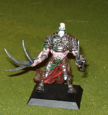
Okay, we've got one miniature and two different ways of taking its picture. Say cheese! The model in question is a Centurius Clone, painted by the Master Manipulator (every store needs one). He shot pictures for Dakka Dakka using advanced techniques (...can you say 'the right way?' I knew you could!); that is, a proper background and light source. Then you've got my typical point and click...
Which is, by the way, the way I've taken every picture for every model that's ever appeared on this site. Assuming it wasn't one I borrowed (...can you say 'stole,' boys and girls? I knew you could!).
These were the best of the pictures that I took the wrong way, holding my camera and taking the picture. I literally took 10 pics this way, and 4 were blurry and unusable and 3 were drowned out by the flash.
With this proper pic, let's talk about the model: I simply love this one. The MM(esno) was going for a realistic look; the red is rich and deep without being toned too high, the high tones in the metal are blended and consistent, and each color is distinct without being over-lined. The skin looks abused by the crap being pumped through it... as it should! But by far my favorite part of the model is the 'face.' You've got an ivory skull mounted over a porcelain mask, two different ivory styles that managed to work off each other, providing a focus for the eye without having to resort to a spot point of red to balance the cloth.
Here are the other pics for you. As always, click on the pic for a close-up.
So obviously these pictures are much better than the first set I showed you... but does that mean you can't take pics without setting up a lightbox or something? The MM(esno) was watching me snap the pictures and made a recommendation, saying I should try it out using the stand and the timer. I also have a macro function, so I could set the camera closer than I'd been doing. Here are the results.
So not bad! Maybe not as good as the proper way, but certainly workable in a pinch. The colors aren't as pure and the flash distorts the mini some, but not nearly as much as when I simply snapped the pics from a few feet away.
So there you have it, if you were at all interested: a few examples of why it is better to set up a proper station for taking good quality pictures of your miniatures. I'm also lucky, since the Master Manipulator (every store needs one) managed to order a few inexpensive light boxes and he's promised me one. I'm really looking forward to increasing the quality of the stuff I'm showing you.
Well, at least the pictures - you'll still have to put up with my painting.
I'm out - Brent
7.06.2010
Subscribe to:
Post Comments (Atom)
Popular Posts
-
"If there is one thing we here at Privateer Press pride ourselves on, it's listening to our audience. You guys and gals have been d...
-
Just a quick update. I may have been a bit carried away adding blood. Ah well. These pics suck a bit. I put the camera too close, screwe...
-
I've been working on a 1500 point Blood Angels army, but I needed something to try my new weathering tools out on, so I took this old Ch...
-
The discerning reader... scratch that. You may have noticed... scratch that, too. It's time for me to admit to you, the audience... ...


2 comments:
I'm definitely a fan of macro, at least a backdrop, and turning off the flash. I look forward to seeing shots using the lightbox...
What he said. Big difference. Now I'm looking forward to seeing a mini shot in a light box, with the macro setting and a timer and stand. And if you could shrink the depth of field until the miniature terrain in the background was just a little blurred... (kidding).
I enjoyed the side-by-side comparisons. Looks like you're moving in the right direction.
Post a Comment