5.22.2013
Subscribe to:
Post Comments (Atom)
Popular Posts
-
"If there is one thing we here at Privateer Press pride ourselves on, it's listening to our audience. You guys and gals have been d...
-
Okay, folks, let's take a brief look at the goodies you MUST can purchase to supplement your games of Warhammer 8th Edition. CliffNot...
-
I've been working on a 1500 point Blood Angels army, but I needed something to try my new weathering tools out on, so I took this old Ch...
-
My brent@strictlyaverage.com email address blew up yesterday with people sending me proof of something that has, until now, only been a rumo...


1 comment:
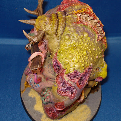
This model looks much better than the stuff you have been turning out as of late. I like what you have done.
The multi-spray base coat is a nice effect but the skin lacks any real depth. Even some simple highlights would have made the skin really pop. I think I could say the same for the intestines. They can be a focal point on a model like this and they are lost in everything else going on.
I was also disappointed to see your crutch colors pop up on this model. The light blue boils and the green skin on the hand are colors you have a habit of using on every model. Since they are out of place with the overall color composition of the model they draw the eye and attention away from other areas that should really be the focus.
Post a Comment